Climate Models
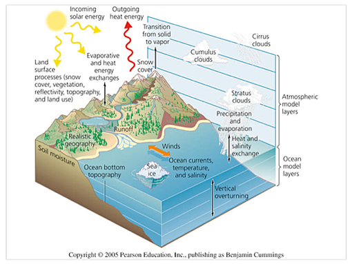
Climate models are mathematical representations of the Earth’s physical properties and their interactions, all of which contribute to climate. Climate models project global climate trends on very large spatial scales using a range of future greenhouse gas emissions scenarios as inputs. These scenarios vary based on differing assumptions about future global population growth, social and economic development, energy sources, and technological advances. Differences in the emissions scenarios, combined with differences in how individual models respond to the scenarios, result in a range of possible futures for the coming decades rather than a single, definitive future. Climate model results have provided scientists confidence that it is important to incorporate both human and natural inputs as we look to projecting future climate.

Figure 1: This graphic shows some of the earth’s physical properties and relationships that are incorporated into climate models.
Although global-scale projections are valuable in many ways, it is useful to know how these projections will affect more localized climate conditions. In response to this need, many research institutions have developed techniques for reducing, or “downscaling”, global climate data to provide information on climate changes and impacts at a more regional level, including the Pacific Northwest. For more information on Pacific Northwest climate change impacts, see University of Washington’s Climate Impacts Group website.

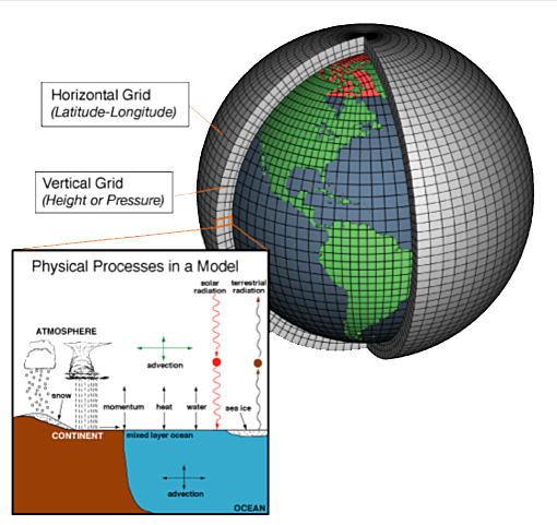
Climate models are systems of differential equations based on the basic laws of physics, fluid motion, and chemistry. To “run” a model, scientists divide the planet into a three-dimensional grid, apply the basic equations, and evaluate the results. Atmospheric models calculate winds, heat transfer, radiation, relative humidity, and surface hydrology within each grid and evaluate interactions with neighboring points.
Climate Model Results
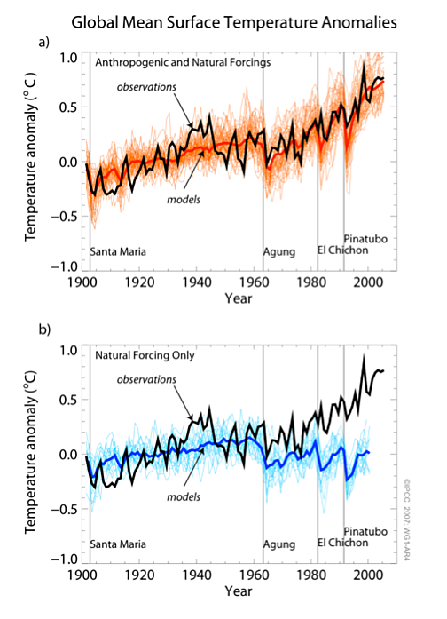
Scientists have been refining and improving models for decades now. As a result the average results of the multiple climate models now reproduce the history of global temperatures remarkably well. The top graph in Figure 1 below shows observed temperature data (the black line) against the range of climate model predictions (the light orange lines) and the average of the climate models (dark orange). It is possible to observe the impacts of volcanic eruptions to the overall climate averages as noted by the lines for Santa Maria, Agung, El Chichon, and Pinatubo. The data sets provided as input into the models in the top graph assume “anthropogenic forcings” which are human created greenhouse gas emissions.
The blue graph at the bottom of Figure 3 shows the model results (light blue lines for all the models and dark blue line for the average results) relative to the observed data if only natural forcings such as volcanic activity, solar radiation and other naturally occurring climate impacts are included. Scientists see the results of this as one example that supports the conclusion that humans are indeed contributing to the increase in global temperatures.
Figure 3: Shows global mean surface temperature anomalies. The top graph shows how the average results of climate models are consistent with observed data if the models include both anthropogenic (greenhouse gas emissions) and natural forcings (i.e., volcanic eruptions, variations in solar radiation, etc.). The bottom graph shows how removal of anthropogenic forcings creates an anomaly in the modeled and observed historic data.
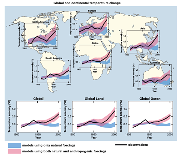
Figure 4 shows how these results can be shown using data and information collected from around the world. The blue bands show the modeling results of climate using only natural forcings, while the pink bands show modeling results that include human created greenhouse gas emissions data. Again, the black line shows observed temperatures.
Once confident that models are able to show relationships accurately by testing against observed data, scientists use the models to project future ranges of what may occur as we plan for the future.

Figure 4 is taken from the IPCC Summary for Policy Makers report and is labeled in that report as Figure SPM.4. This graph compares observed continental and global-scale changes (black line) in surface temperature with results simulated by climate models using either natural (blue) or both natural and anthropogenic forcings (pink).

